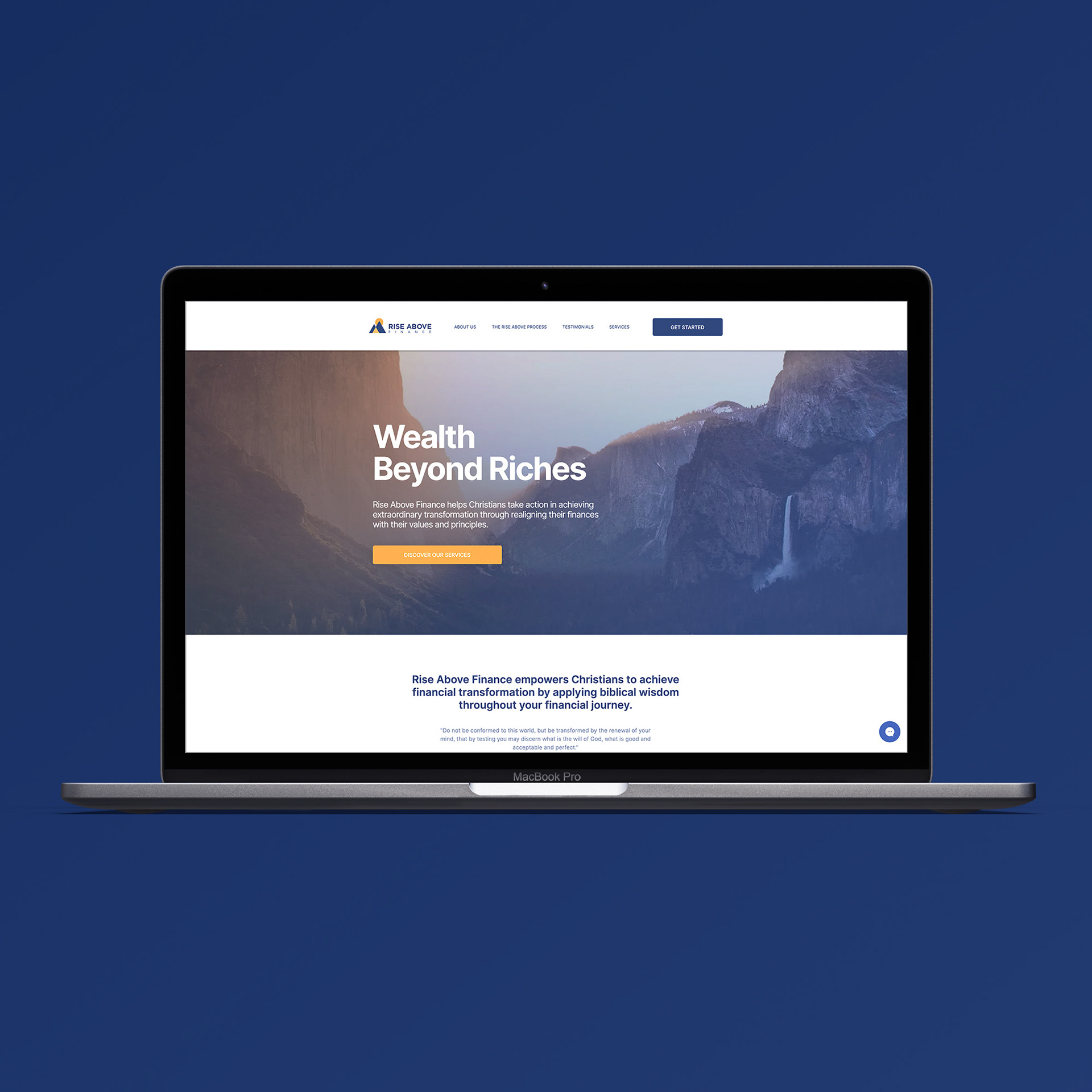
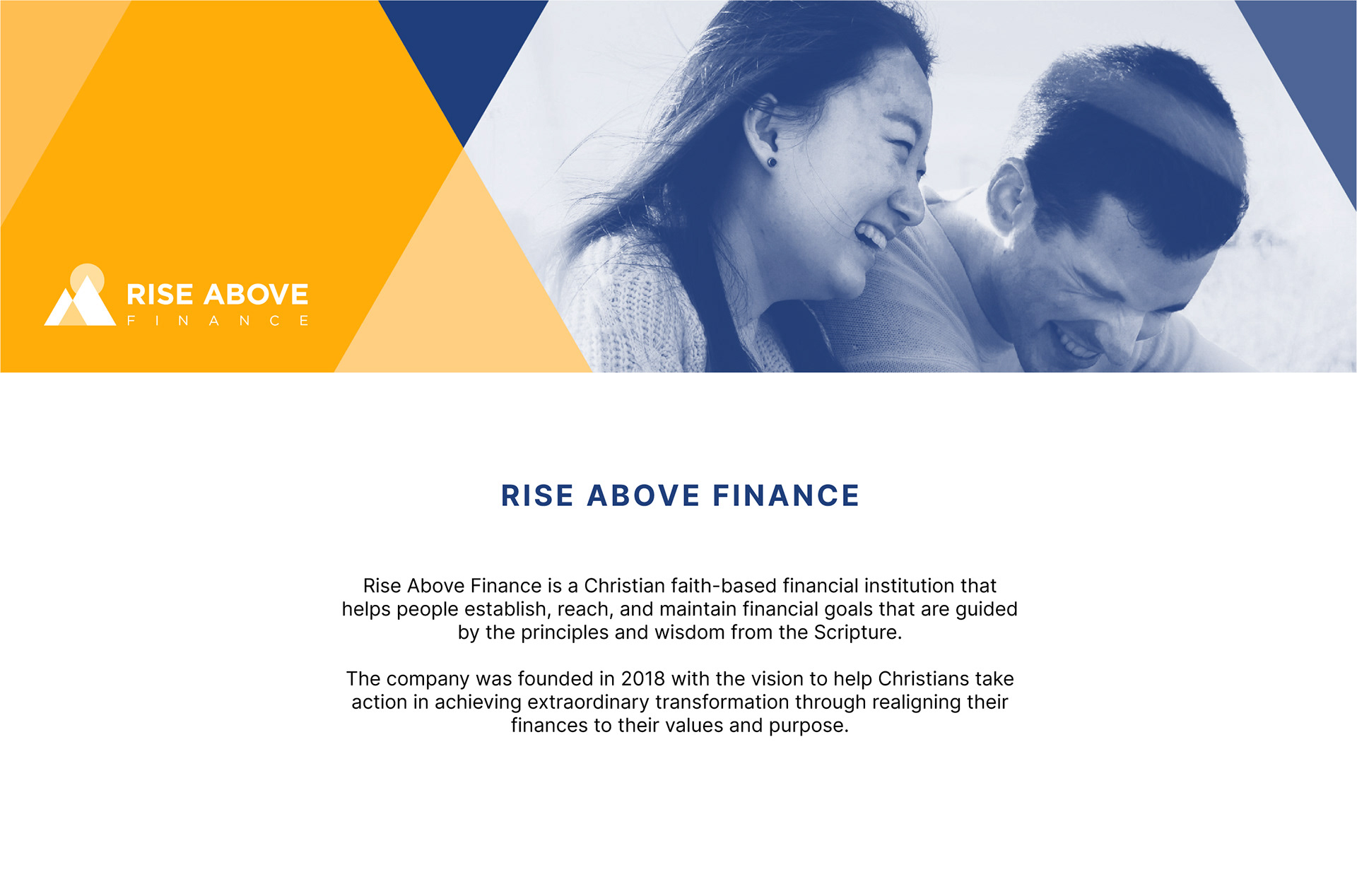
Going forward, Rise Above Finance wanted to take on the financial world with full force by introducing themselves with a fresh brand identity. The client wanted a visual approach that is simple, yet compelling enough to connect with their beliefs and values that are reflected in their service.
When I first sat down with the founders, I asked them questions about where they see the company in 5-10 years, and how the Rise Above Finance brand will evolve. As a result, they wanted a brand identity that is strong enough to branch out into different services within the finance umbrella.
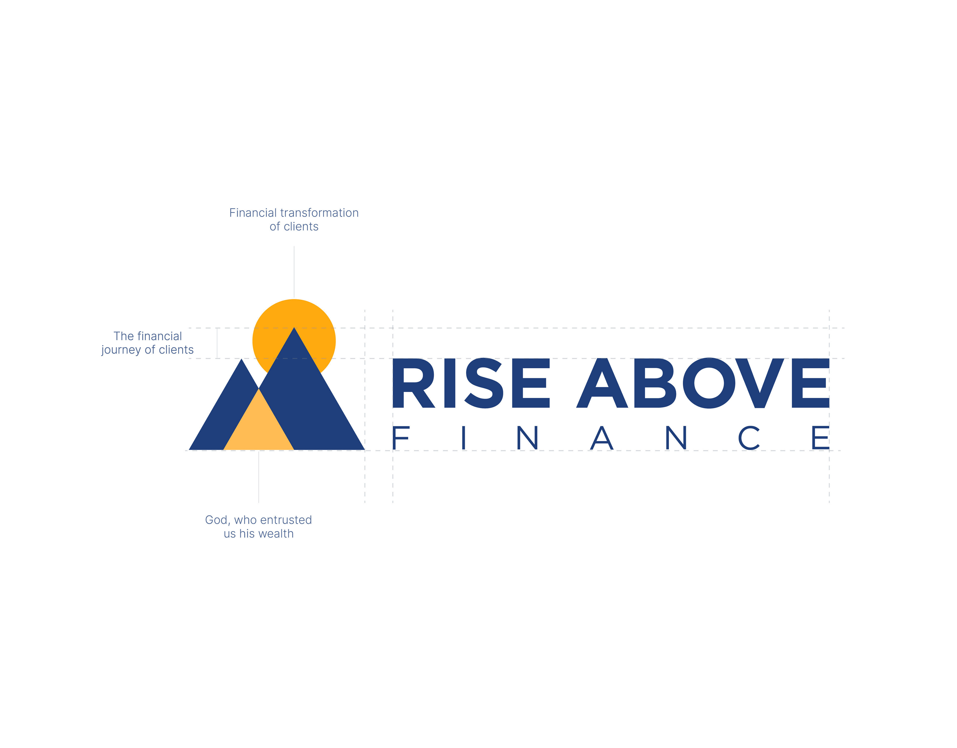
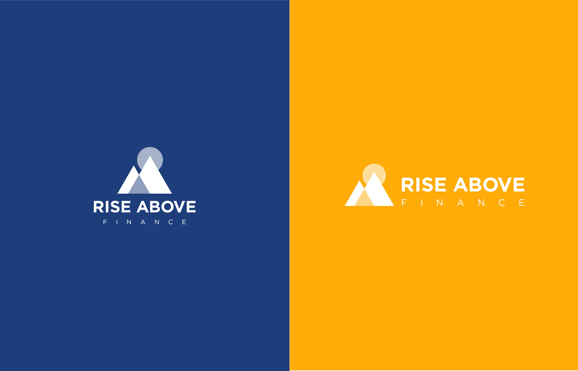
THE LOGO
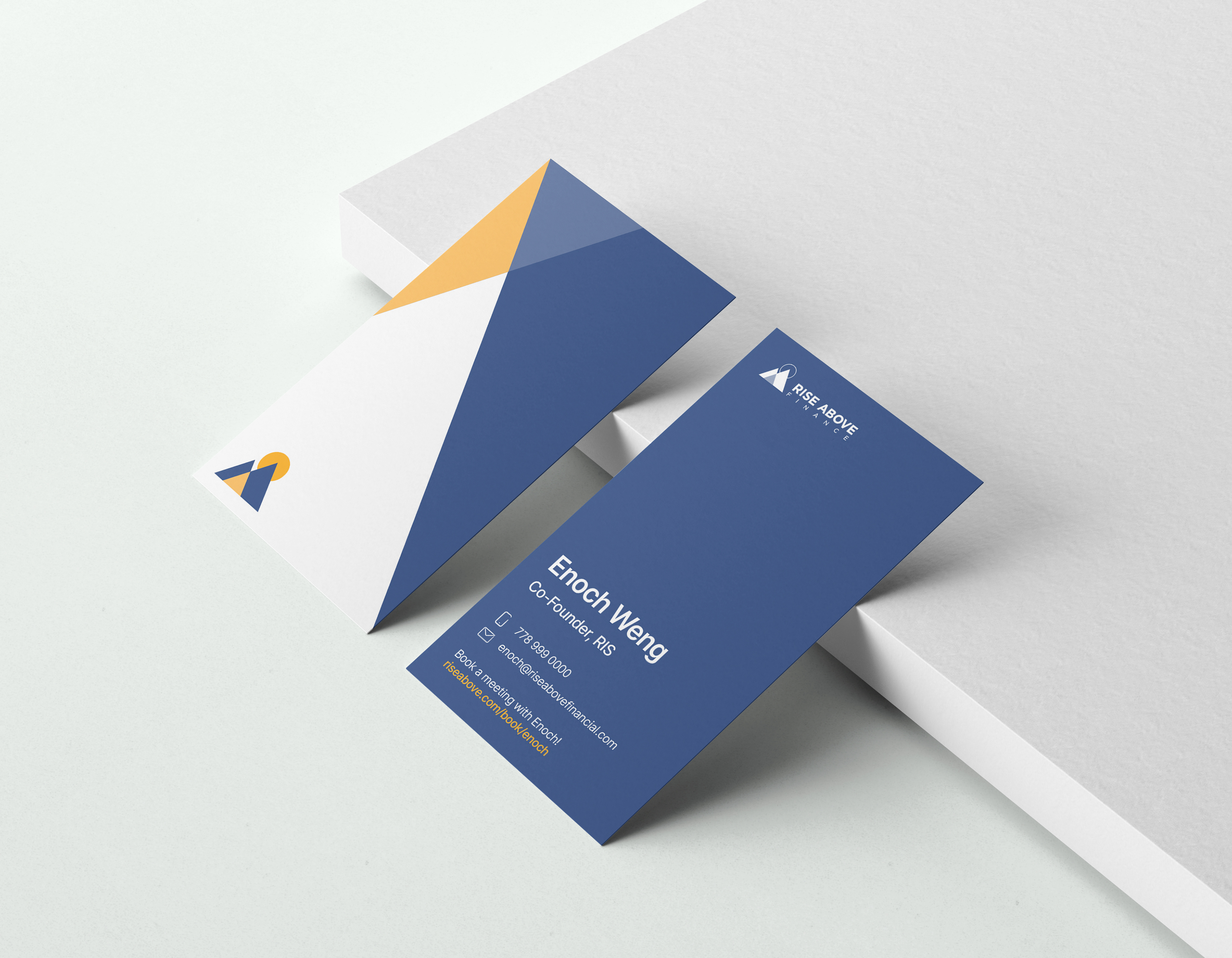
At first, they already had a logo, but it needed that finance touch—trustworthy, reliable, serious, but also approachable and connected. With many financial institutions in the market that have logos that are rigid and serious in nature, they already have set the precedent for Rise Above Finance, and recreating their logo was a challenge that was favourable to both me and the clients.
In terms of longevity, it didn’t capture the long-term vision of Rise Above Finance, and one thing I kept in mind was that they needed a logo that will serve them for a long time because rebranding costs can be astronomical. Therefore, I designed a logo that paid homage to the original one but embodied the essence of financial resilience, growth and success.


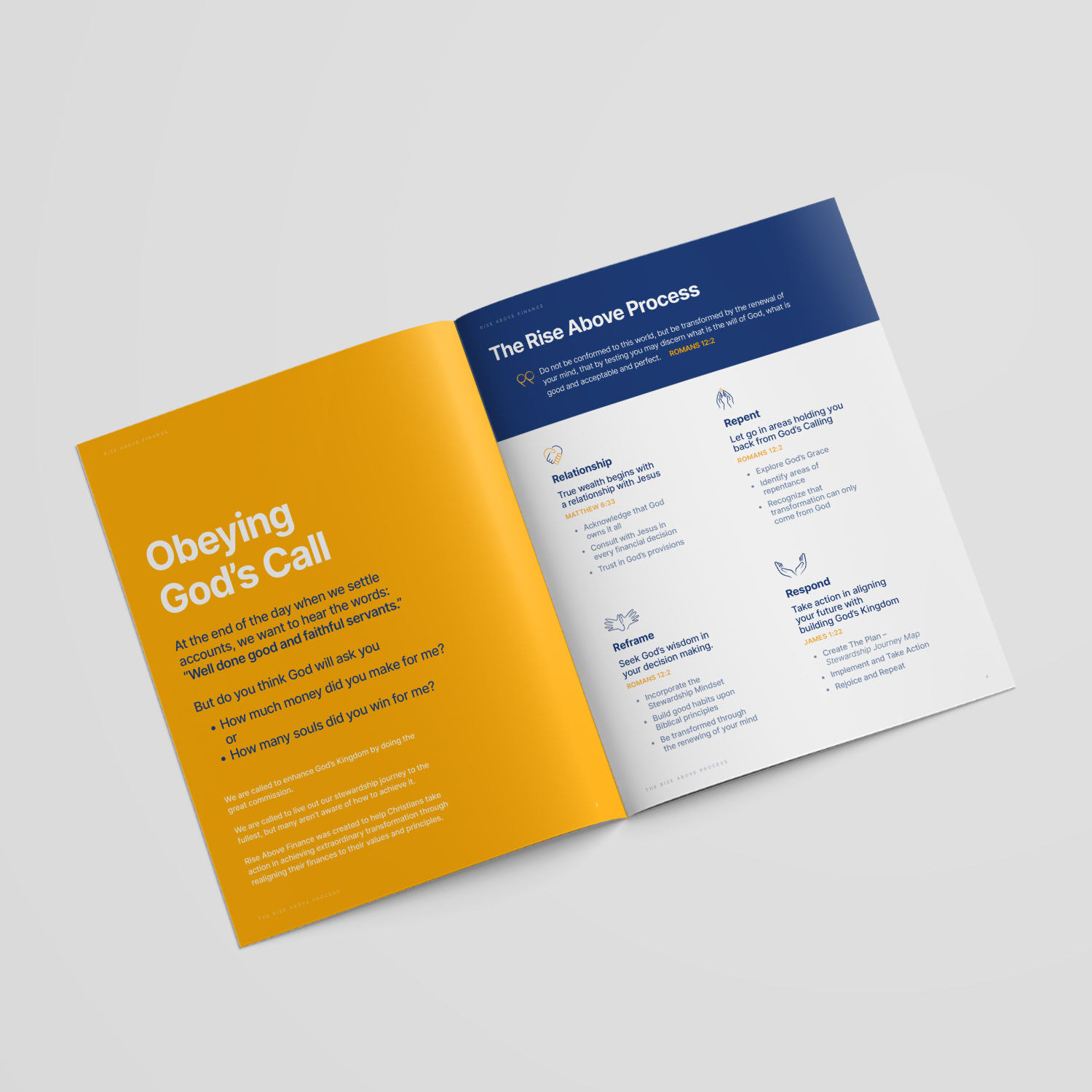
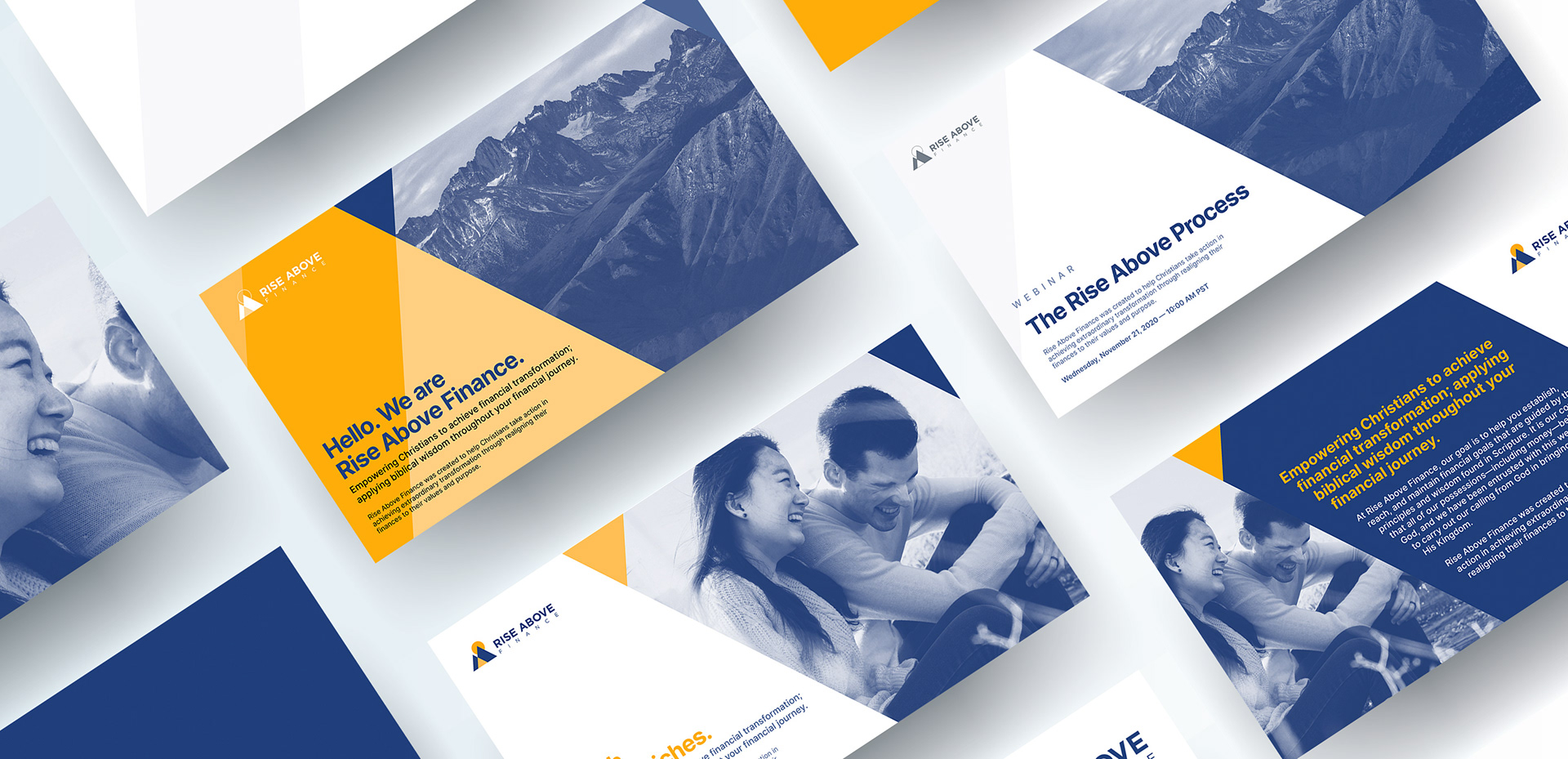
THE ICONS
Icons play a vital role in a brand identity in which they are helpful in communicating a message visually. In the case of Rise Above Finance, the company needed visual tools to convey their story to their current and prospective clients. And it is where the marriage between the copy and the graphic elements makes the message more compelling and easy to comprehend. The icons are created with a round brush stroke and incorporate the Rise Above Finance colours.